>
>
>
Visual management: an essential tool to implement in team management
Visual management: an essential tool to implement in team management
Published on

Do carefully plated dishes make you want to savor what is presented in front of you? Do pretty drawings on your cappuccinos brighten your coffee tasting experience? Does a beautifully decorated home make you feel better at home? Do beautiful clothes worn for the first time give you more confidence for the day? By taking personal examples and observing around you, you will notice that visuals can enhance life’s moments, transform elements that were initially ordinary, improve memory capacity, and encourage motivation to take action...
In the professional world, visuals can also make a difference! Indeed, an excellent presentation of information can considerably help you in your work. Instead of reading data without understanding or retaining it, when well presented, it can make information readable, understandable, and easy to absorb. Companies that use visual perception to clarify their message are actually practicing “visual management” or “data visualization”: a method derived from “Lean Management,” used in project management. Because this concept brings so much to the company, the team, and the individual, we think it is useful to share with you how to deploy visual management.
————
Visual management: what is it used for?
Retaining information better through sight
Before implementing visual management or “data visualization” for those who prefer using the English expression, it is essential to remember the different ways of memorizing information (other than sight): writing, hearing, physical activity, touch, taste ... . As we can observe, memory aids are numerous.
Some people are lucky to have an amazing ability to remember the clothes worn by someone they met only once, several months ago. Others can retain an infinite number of logos and the brands associated with them. Still others can recall the layout and decoration of a place even though they went there only once. Finally, some can easily find their way around a city that was previously unknown to them.
These people are said to have highly developed visual intelligence. However, all of us possess it, even if we do not all use it to its full potential. Some will be particularly enthusiastic about implementing visual management tools because they immediately know they will retain much more. Others will perceive these tools as “trends” that add no value. Whether your visual intelligence is highly or only slightly developed, visual management will prove useful in team project management, and that is what we are going to present.
It is no coincidence that many of us have been bored during a PowerPoint, Google Slides, or Keynote presentation. We have all experienced presentations that are unattractive and unclear, and we want to avoid reproducing that pattern. Many articles exist on the subject, but to give you a few essential conditions to respect: stick to two or three main colors for your slides, structure your slides by placing the most important information in large size and in “bold,” limit text, avoid fonts smaller than 30 pts, and support your points with relevant images.

Visualizing important information at a glance
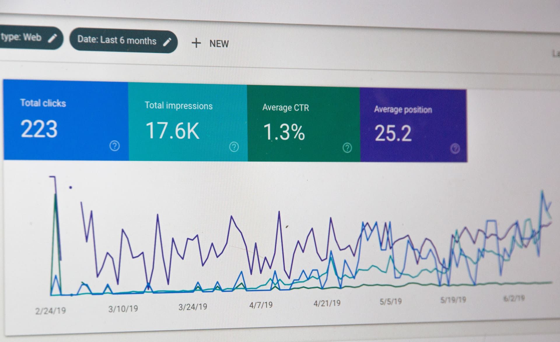
Thanks to visual management tools, each colleague who accesses them knows the actions already taken, those in progress, and those to come. Complex data can thus be formatted in a simpler way, allowing anyone who reads it to understand it.
Presented in the form of graphs, histograms, pie charts, diagrams, or other representations, people using these data visualization tools can more easily spot information and therefore save time. The risk is that they may choose a poor representation of data, making information difficult to understand and, contrary to the intended goal, causing them to lose time.
For example, good use of a pie chart would be arranging portions from largest to smallest, clockwise, thus enabling intuitive reading and easier understanding. Sometimes, when a numerical value is particularly important, highlighting key figures, accompanied by a description, can be more effective than diagrams.

Besides the chosen format, which impacts data understanding, the choice of colors also plays a major role. Colors can be used to categorize information. Take, for example, data written in HTML language, which is displayed in a different color depending on its type (class, content, etc.). For some, data color varying by status (“to come,” “in progress,” “completed”) will speak more clearly. Most often, green is used for a “completed” status, orange for “in progress,” and red for a task not yet created.

Data can take forms other than numbers, diagrams, or text. For example, it can be presented as a digital map. This format is especially used when showing country demographics. Naturally, we understand that the larger a circle is, the greater the population of the city (or region).

Making decisions more easily
Imagine you choose to display your email open rates as a pie chart and observe that there is one month in the year when the rate was particularly low; you could choose to implement the necessary measures: revise your email subject line, change the sender address, choose a new sending time, ... . When presented in a readable way, you can use the information to define appropriate actions.
Still to make the best possible decision, comparing several values can help you. This can be done by observing several data points over the same period, analyzing results from different products, or highlighting the performance of various teams. Curves, histograms, or bars sometimes paired with a specific color code can guide you in your comparison process. As a result, you will be better able to make the most relevant decision.
You notice that a communication campaign launched for the same event but one year apart generated more leads in 2020 than in 2021. By analyzing more closely the actions carried out during each of those years, you could identify the action you missed or carried out poorly in 2021, and thus improve your tasks for 2022.
Having broader knowledge of everyone’s responsibilities
Since visual management promotes project-based work management, each employee can be informed about their colleagues’ activities. The challenge is to realize that combining everyone’s tasks leads to project completion. Everyone contributes their stone to the building. Such transparency can reassure teams, show that every employee’s work matters, and foster understanding of the company.
Examples of data visualization tools and methods
So that you can visualize the tools that fall into the “data visualization” category, we will mention a few. Since there is a wide variety, it is essential to choose the right one according to your needs and your user audience.
Trello
Easy to use, Trello allows anyone to create digital boards using cards that can be placed in columns and moved according to completed actions. For example, the task “Sending the proposal” may move through several columns: first “to do,” then “in progress,” “ready,” “to be validated by manager,” and finally “Done.” To make information as understandable as possible and so collaborators know who is handling the proposal drafting, a different color can be used depending on the person responsible for the action. A red tag for Sacha can be created, a yellow tag for “Louise,” and finally a purple tag for “Paula.”
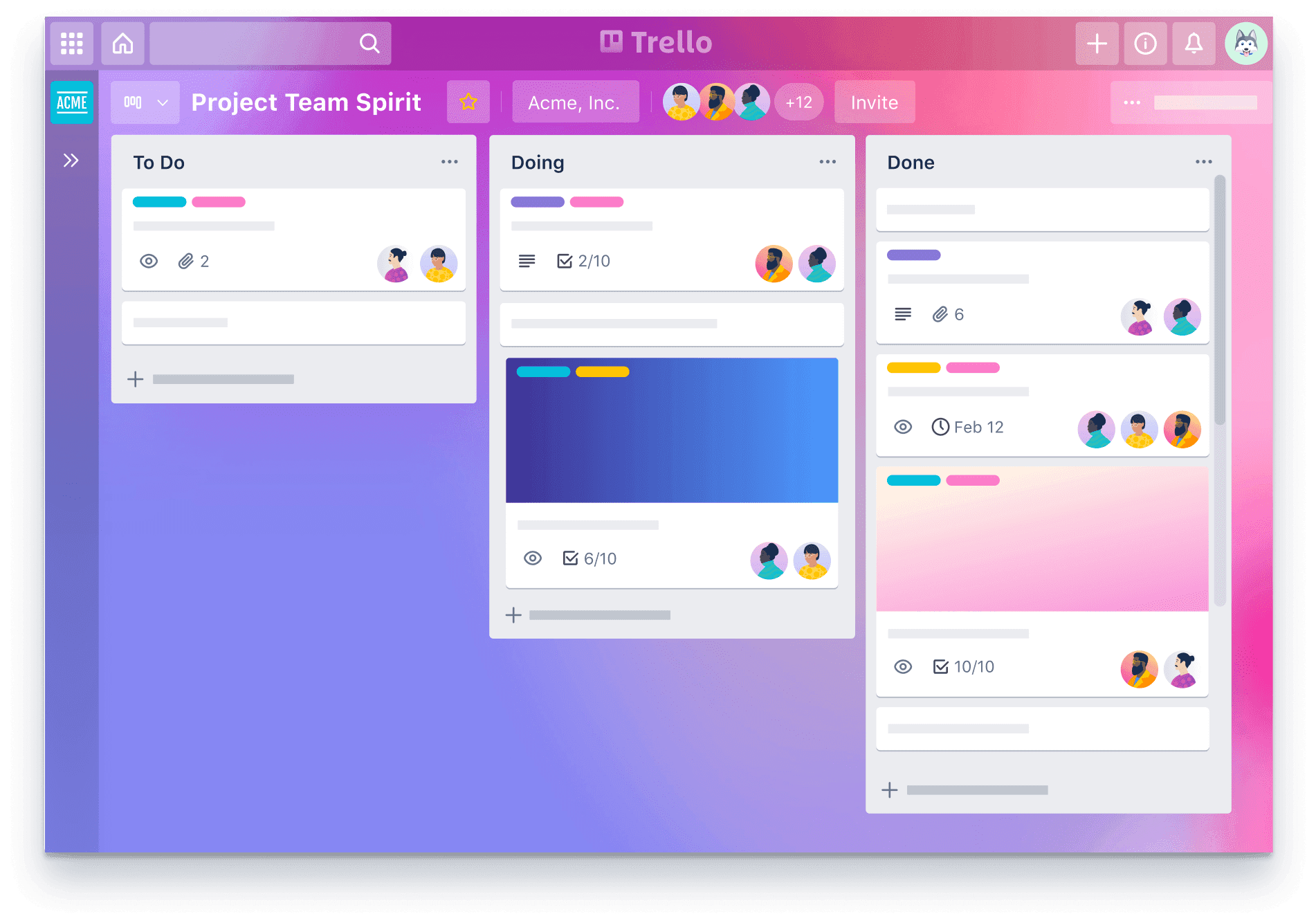
Find the template that suits you on Trello!
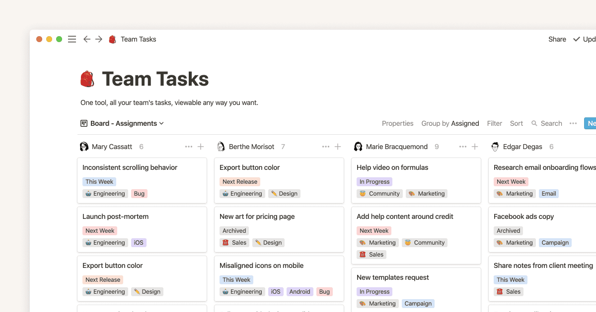
Notion
Another collaborative online task management tool, also easy to use, is Notion. The advantage of this software: **the ability to choose how information is organized—into tables, cards, kanban, calendar, ...** .
However, it should be noted that on Notion and many other tools, it is better to define the company’s needs, challenges, and objectives in advance to find the best possible format. Otherwise, the data presentation may be changed regularly, preventing users from getting used to it.
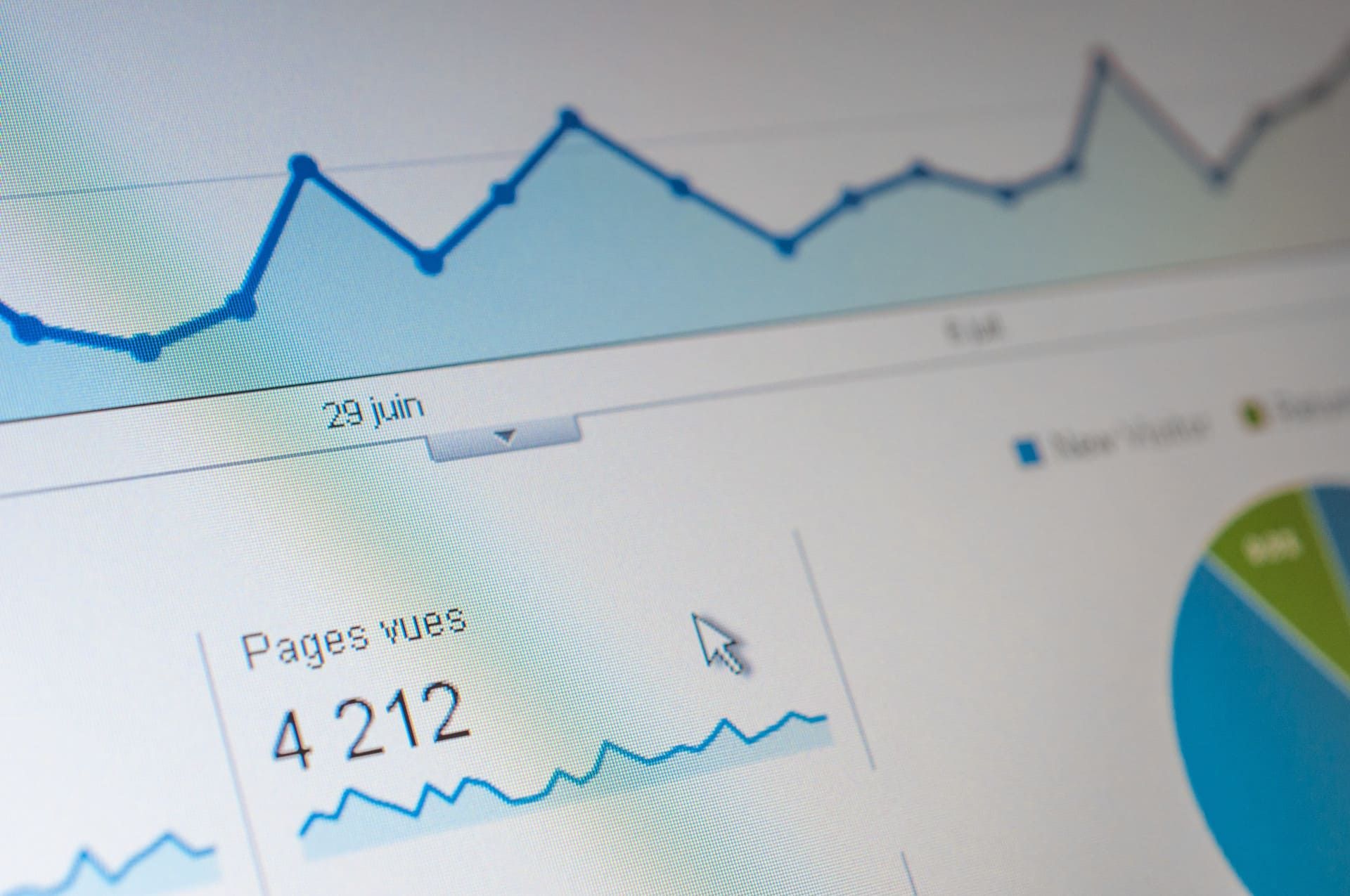
Google Analytics
When you use Google Analytics (this free audience analysis service for your website), you can view the most important data on the home page, go to the categories that interest you most (audience, acquisition, behavior, conversions), choose the most relevant views (graph, pie chart, bars, etc.), and create your own dashboards. In just a few seconds, you are able to identify whether something unusual has happened (e.g., a sudden drop in traffic, a decline in conversions, etc.) and therefore adjust your actions accordingly.
The Eisenhower matrix
Another effective method for sorting tasks is the Eisenhower matrix. Divided into 4 boxes, it encourages users to place each of their tasks into one of the following categories: **important and urgent tasks, important but not urgent ones, not important but urgent ones, and finally not important and not urgent ones**.
Depending on which boxes tasks are placed in, users are invited to take different actions: do it immediately if it is urgent and important, delegate it if it is urgent but not important, schedule it if it is not urgent but important, and finally delete it if it is not urgent and not important.
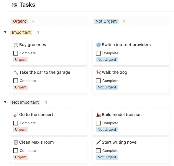
Go here to use the Eisenhower matrix template on Notion!
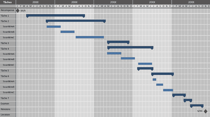
The Gantt chart
To visualize information at a glance over a specific period, the Gantt chart can be suitable. Presented as a table, it highlights a set of tasks (materialized by a horizontal bar) to be carried out between period A and period B. When you are working on a project that extends over a defined duration and your actions evolve, using a Gantt chart may be appropriate. With this tool, tasks are listed in detail and each one is associated with one or more collaborators, so it is easy to know what has already been done, who did it, what is in progress, and who is responsible for the action.
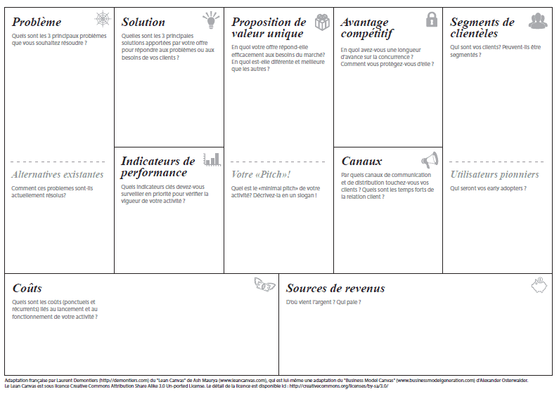
Lean Canvas
When you want to summarize the strategic elements of your current project (or upcoming one), the “Lean Canvas” tool based on the “Lean Startup” movement can help. Arranged as a board (paper or digital), most often in 9 boxes, tool users can view on a single page the strategic information necessary to understand their project. Thus, they can better identify whether the elements put together are coherent and whether a common thread emerges. Otherwise, it means the strategy needs to be revised.
Post-its
Let’s not neglect the traditional post-it method. Often used to remember a task we are afraid of forgetting (“Buy sugar,” “Contact Mr. Durand,” ...), they can also be used in a “brainstorming” context. This technique, which consists of bringing several collaborators together in an informal meeting, allows invited participants to write their ideas on small pieces of colored paper. A project manager then collects the papers to sort them and lead the discussion.
Imagine that you hand out post-its to your colleagues so they can think about onboarding new talent. By combining all their post-its, you could distinguish 3 major categories: integrating the recruit, supporting them in their tasks, and sharing company information with them.

————
As part of project management, using a “visual management” tool can increase employee efficiency. Since they can access data in a simpler way, they will be better able to make decisions aligned with their observations and share information with their team. Thanks to the wide range of tools available on the market (Trello, Notion, Google Analytics, etc.) and the different data presentation formats (pie charts, graphs, curves, kanban, calendar, post-its, etc.), they can find the presentation method that suits them best.
The most difficult part, however, remains identifying the right tool and the right format for their situation. Indeed, depending on their business sector, types of tasks (content production, carrying out several small tasks, ...), way of working (collaborative or autonomous), and validation process, specific presentations will suit them. Reproducing the same data presentation as someone with a model that works may not be suitable for everyone. Looking at what is being done should only serve to provide ideas and personalize one’s information presentation.